


When I started learning react, one of the hardest decisions for me was deciding on a particular styling option to use for my project. CSS is very humbling and having to combine it with react was even more humbling for me. After making research about it, I came to the knowledge of diverse styling options for react application. The aim of this article is to expose you to the various styling options you may not know about or know how to use.
"Variety is the very spice of life, that gives it all its flavour", why limit yourself to one option when there is a pool of others to explore.

Some of these styling options include:
- Inline Styles
- Styled Components
- CSS Modules
- CSS stylesheet /Vanilla CSS
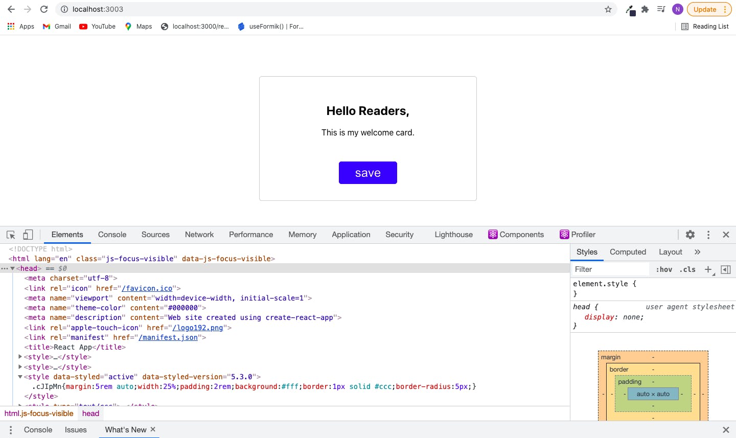
- Inline Styles: To be able to use inline style with react, you have to set a style attribute in the HTML tag to a value with a regular javascript object. An inline style in a react application is written like an object instead of a string. The first set of curly brackets tells jsx parser that the content between the bracket is javascript and not a string while the second set of curly brackets initializes a javascript object as seen in the image below.
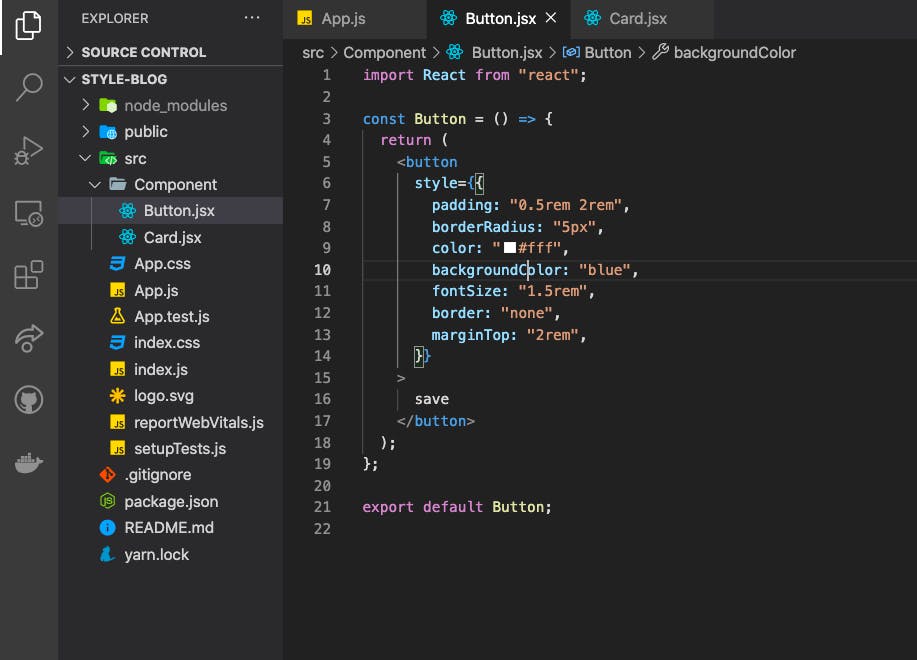
For you to be able to use CSS property names that are hyphenated, you either wrap it into quotes. For Example:
 <button
     style={{
       "border-radius": "5px",
       "background-color": "blue",
       "font-size": "1.5rem",
       }}
    >
     save
   </button>
or you use a camelCase instead of the hyphenated style. For example:
 <button
      style={{
       borderRadius: "5px",
       backgroundColor: "blue",
       fontSize: "1.5rem",
     }}
    >
     save
   </button>
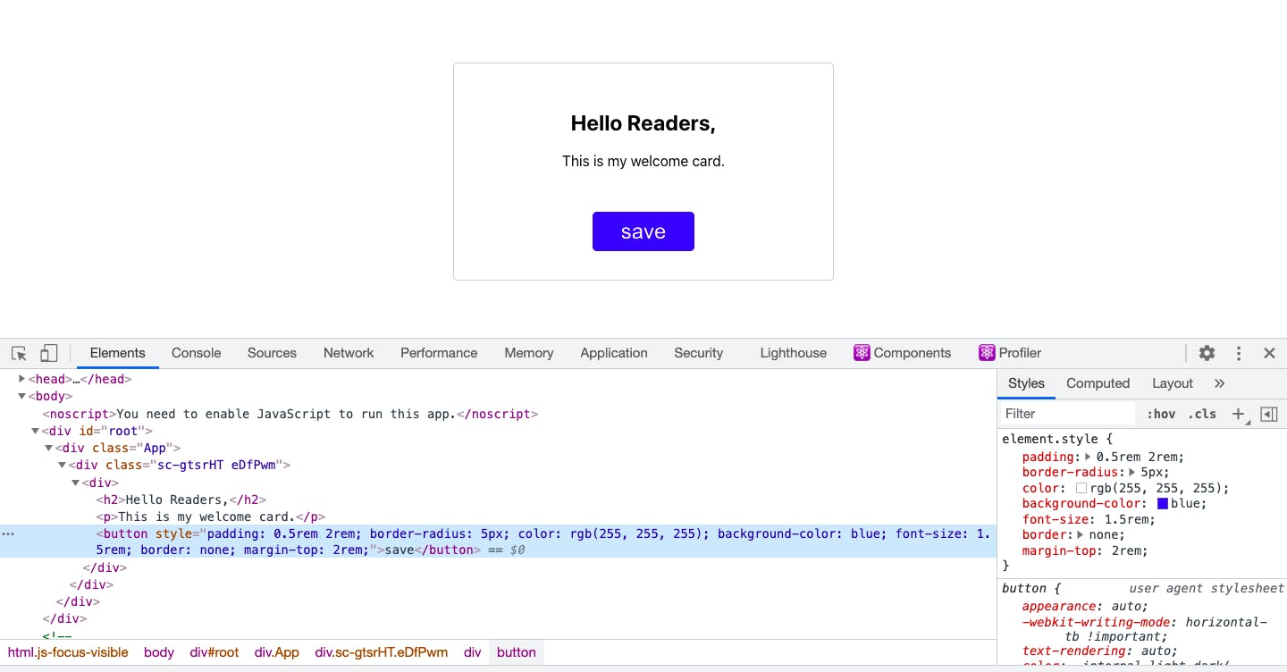
If you inspect your web page with the dev tool on your browser, you will notice that the styles are added as inline styles.
You can also separate your style from the HTML element by writing it in a constant as seen below. With this, you can use it in other elements.
const stlyedText = {
 fontSize: "2rem",
 color: "#000"
}
const Card = () => {
 return (
   <>
     <p style={stlyedText}>This is my welcome card.</p>
     <span style={{ ...stlyedText, marginLeft: "5rem"}}>Thanks</span>
   </>
 );
};
This approach of styling react applications using inline styles is mostly adopted by developers when learning react for the first time. I also want to bring to your notice that in as much as it is pretty simple to start off with, there are a couple of drawbacks.
- Using inline styling requires that your style information is part of your javascript file.
- Inline styles do not take advantage of the cascading nature of CSS.
- You cannot specify media queries with inline styles.
- It is also not possible to pass pseudo-selectors to an element styled with an inline style.
A pseudo-class is used to define a special state of an element. You can learn about it from w3schools
Inline-styles are sometimes good especially when you are adding few styles that will only be needed in that component but it is not good practice to always use inline styles.
- Styled Components: Styled Component is a library that allows you to create a component with a syntax that uses a javascript feature called tagged template. You can use pseudo-classes and vanilla CSS with styled-components instead of working with javascript properties to which you assign values.
Getting Started with Styled Component
Install the package with:
npm install --save styled-components
yarn add -D styled-components
- Import the package as an object which you can name however you like. For Example: import styled from “styled-components”.
- Create a constant in the file you want to use the styled component. You can name it however you want but start with a capital character so it can be seen as a component.
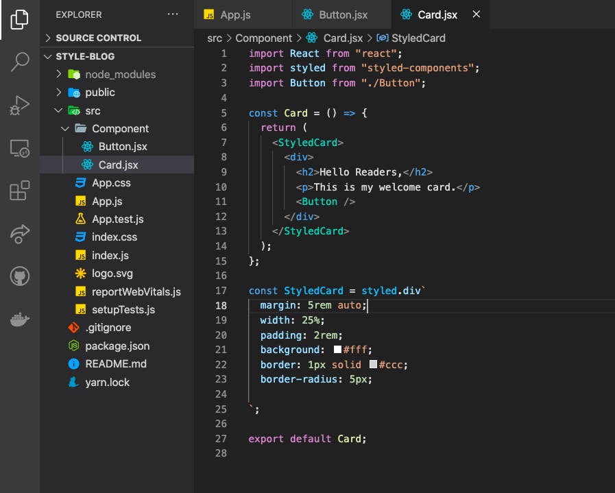
There are so many methods provided in styled-components, these methods represent our HTML tags. You can choose a particular method that soothes what you want. In the image above, I used a div element. Other methods available are span, li, main, header, p, ul, img, etc.
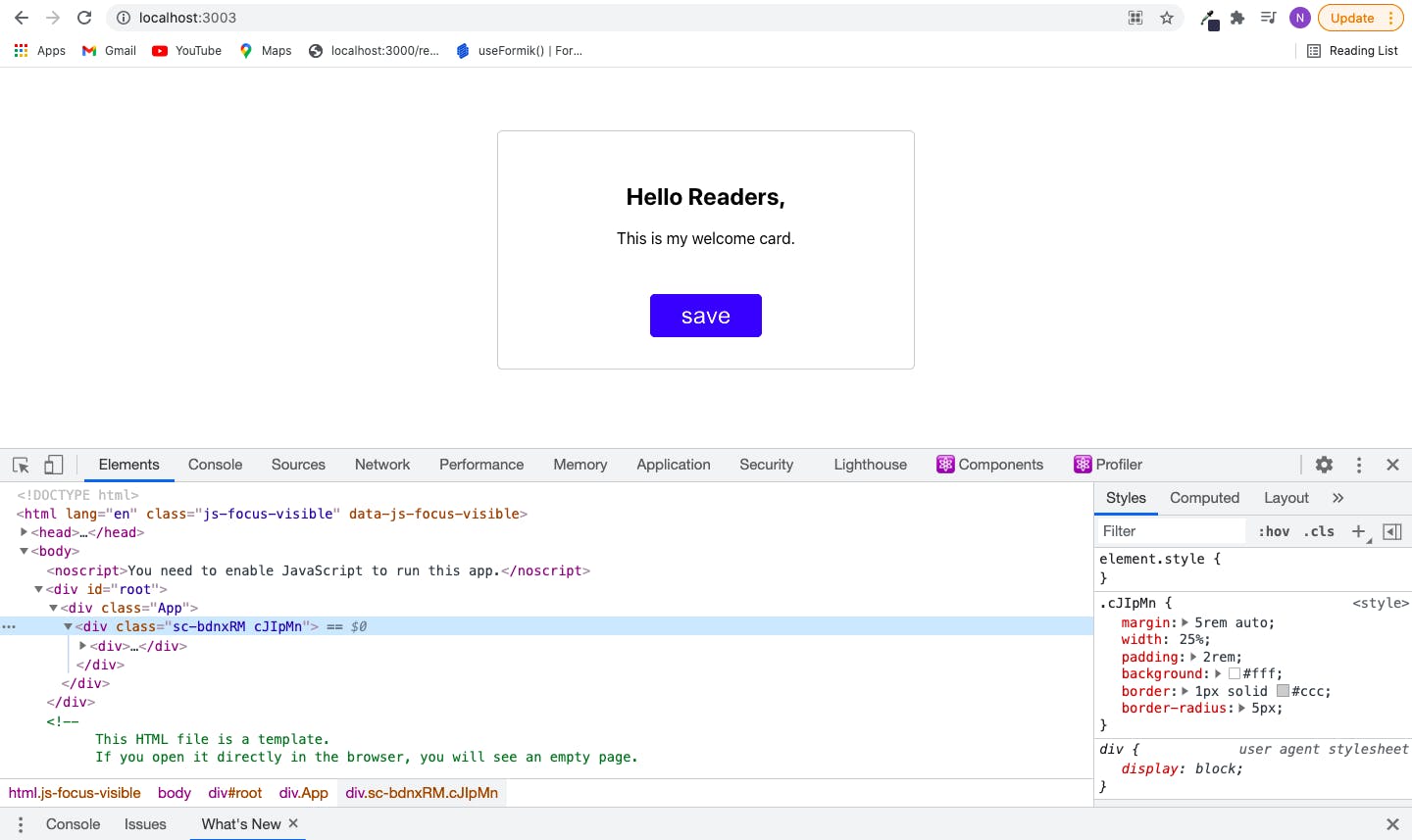
When you inspect your page with the dev tool, you will notice a class name was assigned to the element created from styled-components. This is because it is extracted as vanilla CSS and injected into the head tag of the HTML document.
Styled Component makes our code easier and readable than inline-styles but just like inline styles, you still have your CSS inside your javascript file. You can check out their documentation for other features styled components provide. Styled-components
- CSS stylesheet/ Vanilla CSS: You can use CSS stylesheet by creating a CSS file and importing it into your javascript file. This is very simple to use.
./Card.jsx
import Button from "./Button";
import "./Card.css"

const Card = () => {
 return (
     <div>
       <h2>Hello Readers,</h2>
       <p>This is my welcome card.</p>
       <Button />
     </div>
}
}
./Card.css
h2 {
color: "red"
}
The problem with this way of styling is that it is not scoped to a particular component. You can consider using this approach of styling your application if you want your styles to be globally scoped. For example, there are cases where you might want all your button elements to appear the same.
One way to fix the global scope issues that the CSS stylesheet option creates is by using BEM (Block Element Modifier).
Block Element Modifier is a way of using class names that you guarantee are unique. Instead of styling our h2 element the way we did above. We can give it a class name and then style the element using the class name.
<div>
       <h2 className="header">Hello Readers,</h2>
       <p>This is my welcome card.</p>
       <Button />
 </div>
One drawback with using the BEM alternative for vanilla CSS is that you may unknowingly use the same class name in different components or files and the essence of creating a unique appearance for your elements is being defeated.
- CSS Modules: This is supported by projects created with create-react-app. It is a CSS file in which all class names and animation names are scoped locally by default. With CSS modules, webpack build tool goes over our CSS files, tweaks our class names to guarantee uniqueness.
To let react know you are using CSS modules, name your CSS file with the .module.css extension.
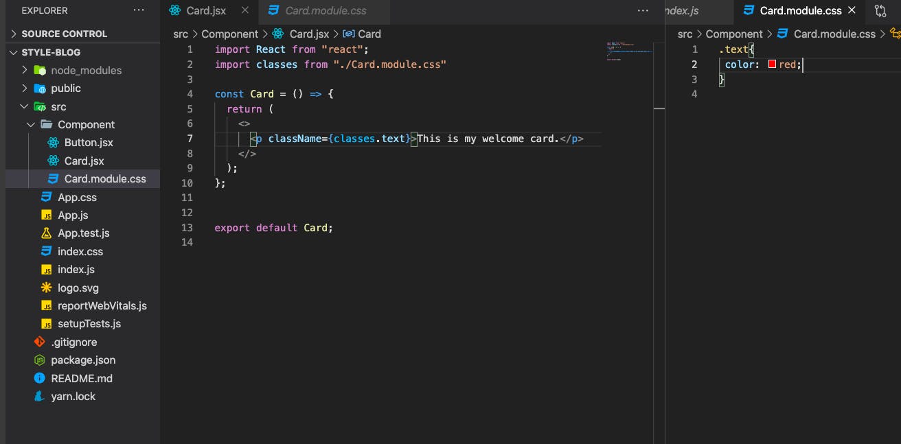
It is very common for developers to name their CSS class names with hyphens in between like text-style. In order for you to use the hyphenated class name, you have to use bracket notation as seen in the example below.
import React from "react";
import classes from "./Card.module.css"

const Card = () => {
 return (
   <>
     <p className={classes["text-style"]}>This is my welcome card.</p>
   </>
 );
};
In this article, I looked at a diverse pool of options for styling react applications whether they are highly rated or buried underneath. I want you to know that it is very okay for you to explore diverse options so you will have an understanding of how to work with them. There are so many other options this article did not cover, I encourage that you make a good research on them and share your ideas in the comment section.